Visualizing a Single Point in Canvas
June 15, 2020 /
0 comments / in
Canvas
/ by Walter Goodwater
I was recently asked to give a presentation on Canvas to showcase its power as an HMI authoring platform to potential customers. I’ve given lots of presentations on Canvas over the years, usually highlighting new and exciting features with each release. Just talking about new 9.4 features took me over an hour at WESC, and three separate blog posts here; for this presentation, I had about 15 minutes. So instead of trying to talk too fast or cram too much in, I decided to take my audience on a journey.
It starts with a single point value, and a text tool.
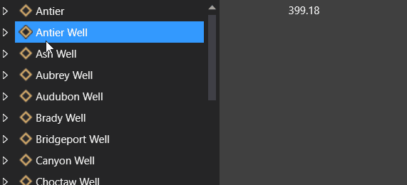
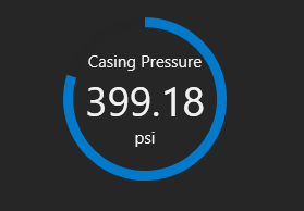
Let’s go with the casing pressure on a Well facility. A simple text tool will quickly show us the current value for this point, and we can even set up a tag chooser to swap in different facilities.
Great. But what we have here is a piece of data, and what we want is information: something we can take action on. What separates actionable information from opaque data is context.
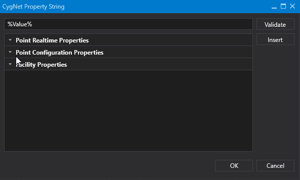
What context might be useful here? Units, for one. A number without units could mean anything. The text tool’s tokenized Text property allows us to easily add that (or any other point or facility configuration).
But while this gives us some context for the number we’re seeing, it doesn’t help us understand the number within the specifics of the particular well. The same number could be fine for one well and disastrous for another. What we need is a way to interpret the value within expected ranges.
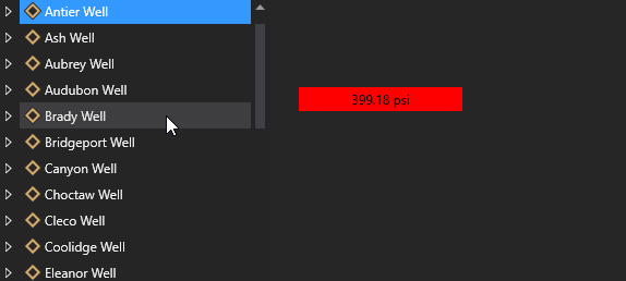
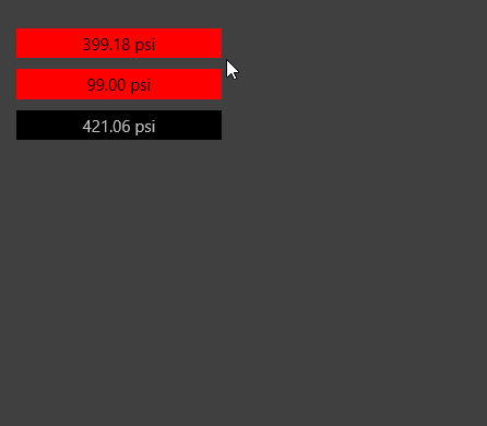
Alarms can help with this, and again the text tool is able to display this information. With the background and text colors driven by point state, we can immediately know when a value is aberrant.
This is a great model for cases when we need to see the value. But we shouldn’t assume that displaying information always requires giving more detail. Sometimes – even often – it means showing less. It comes back to understanding what the end user needs in order to make a decision. Do they need to know that the casing pressure is 74.8 psi? Or do they need to know it is in the middle range of expected values? This is where visualizing data comes in.
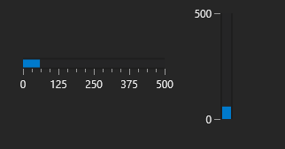
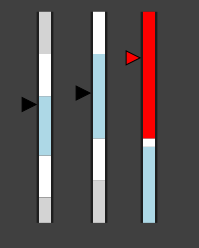
A simple tool for visualizing a point is a linear gauge. With a range of expected values that can be configured on the control or as attributes of the point, we can create a visual interpretation of the current value, not just the raw value itself. Is it close to the top? Lingering at the bottom? Or right where it should be?
And of course alarm colors can come into play here as well.
A more modern tool with similar benefits is our donut control. This control also allows for multiple tokenized fields for additional context.
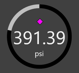
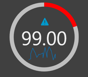
While it is helpful to know where a value falls in a range and whether or not it is in alarm, there are other states that might prove useful. For example, what if the value isn’t in alarm, but is very close? That’s where our value indicator can help. This control looks like the linear gauge, but instead of visualizing the scale of your data (how much the current value fills a specified range) it visualizes where your value falls within various point states. When the value crosses an alarm threshold, color is used to indicate the current state.
But of course color alone is insufficient to indicate critical states. So let’s say you wanted different icons to show up depending on the state of your point, though you still liked the visualizations provided by the other controls. So now we can construct a Canvas object – multiple controls working together that can be easily added to any screen and updated in a single place, with changes applied to all objects on any screen.
Here is an object that uses the donut control to provide current value context and an image control to provide alarm context.
So far we’ve used units, value ranges, and alarm state to provide context to our value. Another important source of context is value history. Is my current value trending up or down? How steady has it been over the last day? Using the sparkline control, we can easily integrate historical trends into our Canvas object.
And since we’re using objects, if we add a sparkline to the source .cob file, all objects we’ve placed on existing screens will automatically update with our change.
So now we’ve used many Canvas controls along with the Canvas object feature to include a wealth of context to our single point. However now we have a new problem: data density. Imagine a screen with dozens of our objects on it. With so much to draw our attention, valuable (and actionable) information could get lost in the noise.
What we need is a solution that allows for simple and sparse data and enables quick, easily access context.
Our journey comes full-circle, back at the beginning with our text tool. But now this isn’t just a text tool. Since we built a Canvas object, we have another option: object tooltips.
So now we have simplicity and on-demand context, the best of both worlds. Since an object can be whatever you want it to be, these tooltips can provide whatever information you deem relevant for the point in question. And it can be templated, as the facility for the text tool (or whatever control) is passed into the object.
And we’ve completed our journey with displaying this single point of data in Canvas. Hopefully this has helped to illuminate just a few of the ways that Canvas can create HMIs that help your end users take action.
Share this entry