Canvas Preview: Chart
October 24, 2017 /
0 comments / in
General
/ by Luke Williams
If you’ve been using CygNet for even a little while you will have heard discussion and seen presentations about the next CygNet HMI, Canvas. With its impending official release this fall we continue this multi-part series by introducing you to some of Canvas’ new and exciting features.
The last post introduced you to the Tag Chooser, which you’ll see in action today in this post.
In this post we will introduce the Chart.
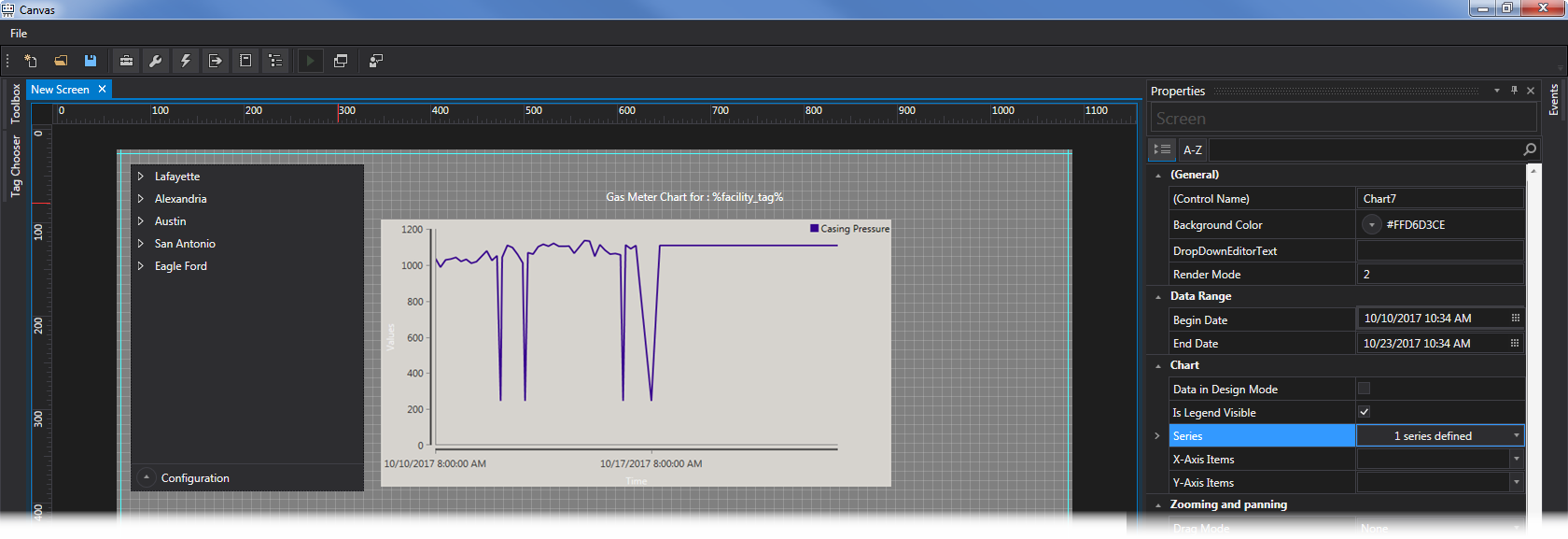
The Chart is the Canvas control used to graph point values.
Where the Trend in Studio took some getting used to and could be fairly complex to configure, the Chart is simple by comparison, though its simplicity belies its power. So just how easy is it to configure? The answer usually would depend on what you want the chart to display, and who should be able to configure it. Though regardless of your needs, the answer is the same. Easy!
Configuring a Series
The Chart can be statically configured at design-time using a Series, similar to how the Grid in CygNet Studio was configured.
One of the goals when designing the Chart control was to provide an intuitive process for getting the control to display what you want without being heavy handed. What UDC do you want on the chart? Just configure a Series, and set the UDC. That’s it! Any additional configuration is optional!
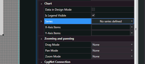
Adding a Series to the Chart
Site.Service and Facility assignment
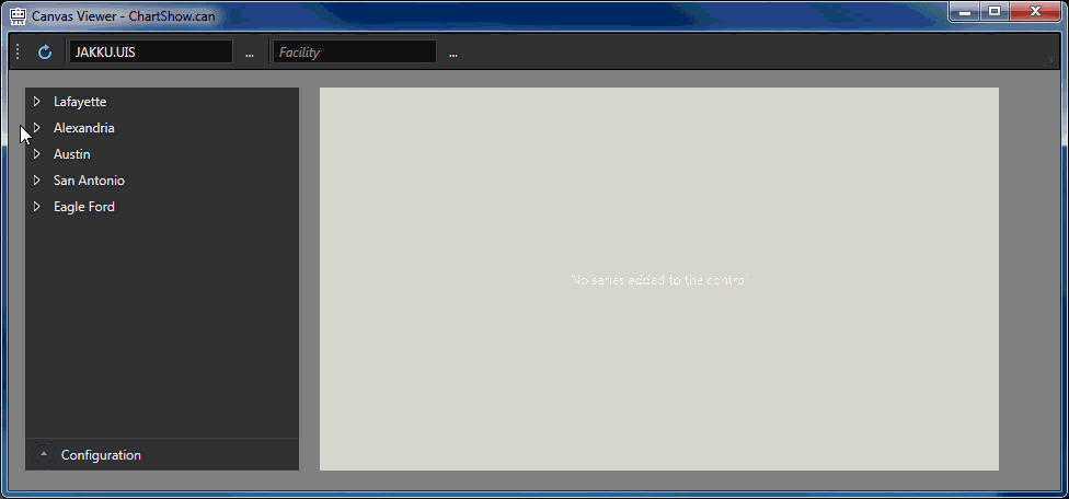
The Chart can be configured to inherit the Site.Service and/or the Facility from the screen as you might expect.
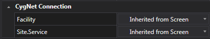
Site.Service and Facility Configuration
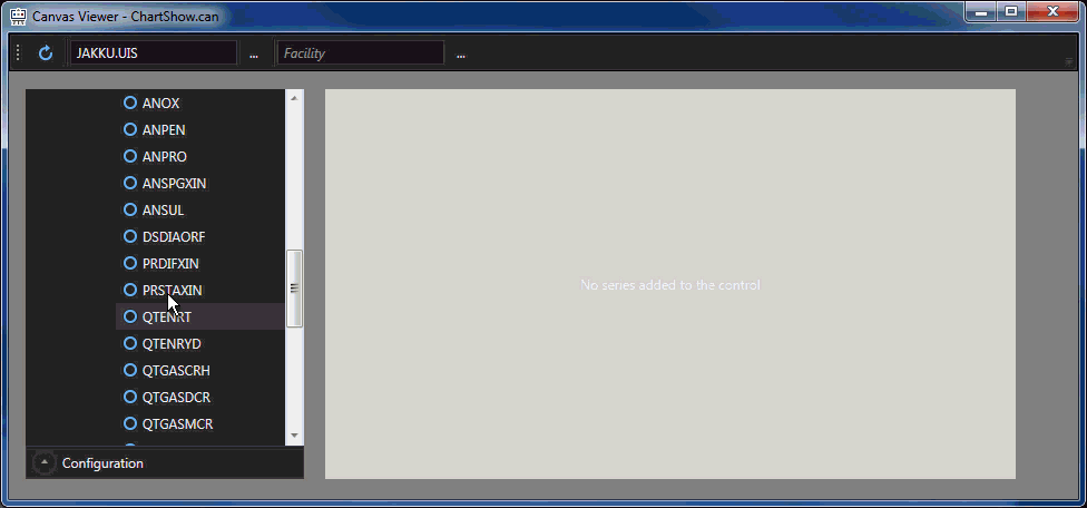
At run-time a user can reconfigure the Facility assigned to the Chart by clicking another Facility from the list.
As an example, while in run mode, select a Facility from the Tag Chooser. Having already configured a Series to display Casing Pressure in design-time the Chart will display the data for Casing pressure for the selected Facility, and update accordingly when the Facility is changed in the Tag Chooser.
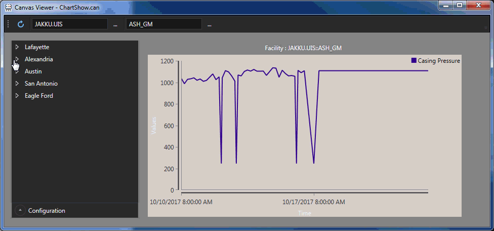
Run-time Chart Facility Selection
You may have noticed a Text Tool above the Chart, notice that it’s dynamically changing a portion of its Text as the Facility is changed from another control. We’ll have an upcoming post dive deeper into some of the features of the new Text Tool control.
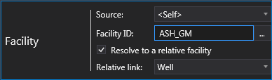
Relative Facilities
Canvas controls can be aware of how your site is configured and which Facility Attributes a Facility should Reference in respect to associated Points. Does your Gas Meter link to a Well? If you configure your Chart to be associated with a Well but set a Series to display a Point associated with the Gas Meter, no problem, Canvas is aware of the relationship and can display the Point from the Meter on the Well Chart!
Relative Facility Selection
Stay tuned for a post covering how Relative Facility configuration works. For now, just know that the Chart is able to display the values you want in a way that is easy and intuitive.
Design-time preview
Traditional Studio Trends can be challenging to configure in the sense that after adding several Series not knowing what it looks like without having to preview the screen. The Canvas Chart control offers a better way!
Design-time Preview
In addition to simple design-time configuration, you can also display chart data in design-time without having to place the screen into Preview mode!
But wait, there’s more!
Drag-and-drop UDCs
In designing the Chart control, we reached out to you and asked what features you wanted for specific controls. One of the most requested features for the Chart control was the ability to drag-and-drop UDCs in run-time onto a Chart. We’re happy to tell (and show) you that the Chart not only supports this, but that it is REALLY easy to do.
Drag-and-drop UDC
Another benefit of this drag-and-drop method is that rather than having to pre-configure every Chart, a single Chart can be used and a depending on which values a user wants to see, they just drag the UDC desired over to chart it.
And because its so fun to use, here’s another example of adding multiple points to the same Chart.
Drag-and-drop
Other Chart Features
No Chart control would be complete without the ability to save or export its contents. We’ve included a toggle-able Toolbar that can be placed at the Top or Bottom of the Chart that supports printing, exporting the Chart as an image (in PNG format), or exporting to a CSV.
Of course the Chart supports zooming and panning, adjustable date ranges, both static and dynamic Series support, and configurable background and Series colors.
We’re only introducing the Chart here today and there will be more examples and information about how to use and configure it down the road.
The next post will introduce another heavy hitter in Canvas, the Grid control.
Share this entry